

Understanding Salesforce Reports and Dashboards
In the bustling world of modern business, making decisions without data is like navigating a dark room without a light. For Salesforce users, reports and dashboards are the torches that illuminate the way, providing critical insights that help businesses understand their performance, identify trends, and make data-driven decisions. Let’s dive into why these tools are indispensable for today’s businesses.
What Kinds of Reports does Salesforce Offer?
Salesforce reports are not just tables filled with numbers and text; they are dynamic, customizable visualizations that bring data to life. Here’s a look at the various types of reports available and how they can serve your business:
- Tabular Reports: Think of these as your basic spreadsheets but with superpowers. They’re perfect for listing data in a simple format. For instance, you can quickly see all your contacts or a list of leads.
- Summary Reports: These reports take things up a notch by allowing you to group data into categories. Imagine seeing your sales performance by region or product; summary reports make this analysis straightforward.
- Matrix Reports: For those who love cross-tabulation, matrix reports are a dream come true. They let you group data by both rows and columns, providing a two-dimensional analysis. It’s ideal for comparing product sales across different regions and over various time periods.
- Joined Reports: Need to view related data side-by-side? Joined reports are your go-to, allowing you to analyze different business aspects together, like comparing sales data with customer support data to identify patterns or discrepancies.
- Cross Filters Reports: When your data analysis needs to dive deeper with multiple layers of filters, cross filters reports come into play. They help you sift through the data with a fine-tooth comb, uncovering the specifics you need for detailed analysis.
Exploring Salesforce Dashboards
Salesforce dashboards transform numbers and data points into a story about business performance, using visual elements like charts, graphs, and gauges to represent complex information at a glance. Here’s a more detailed look at the variety of dashboards Salesforce offers and how each can be utilized:
- Standard Dashboards: Jumpstart your data visualization with pre-built options that give insights into common areas like sales leads, customer service efficiency, and more. They’re a quick way to get started without needing custom setups.
- Customizable Dashboards: Tailor your dashboards to fit your exact needs. You can select which data to display and how it’s presented, ensuring your team focuses on what’s most important.
- Dynamic Dashboards: These dashboards adjust their data display based on the viewer, providing personalized insights. This means a manager and a team member could see different data relevant to their roles, all from the same dashboard.
- Mobile Dashboards: Accessibility is key in our fast-paced world. Mobile dashboards ensure you have critical business insights at your fingertips, making decisions faster and more responsive, no matter where you are.
- Historical Dashboards: Tracking progress over time is crucial for any business. Historical dashboards allow you to look back and understand how data trends have evolved, helping you make more informed predictions for the future.
- Comparative Dashboards: See how different segments of your business compare with one another. Comparative dashboards make it easy to spot which areas are outperforming others and which need more attention.
- Console Dashboards: Specifically designed for users of Salesforce Service Cloud, these dashboards provide a comprehensive view of customer service performance, including case management and agent productivity.
- Visualforce Dashboards: For those who need even more customization, Visualforce dashboards offer the ability to use Salesforce’s powerful programming language to create completely customized dashboard experiences.
- AppExchange Dashboards: Extend your dashboard capabilities even further with third-party applications and dashboard tools available on Salesforce’s AppExchange. This marketplace offers a wide range of options to enhance your data visualization.
Reporting and Dashboard Tips and Best Practices
Making the most out of Salesforce reports and dashboards is crucial for transforming your raw data into actionable insights. Here are some strategies and best practices to help you create more effective reports and dashboards:
- Capture the Right Data: The foundation of any insightful report or dashboard lies in capturing and utilizing the correct data. Identify key performance indicators (KPIs) and metrics that align with your business objectives. This might involve streamlining the data you track to focus on what truly impacts your business decisions and outcomes.
- Implement Naming Conventions: Establish clear, consistent naming conventions for your reports, dashboards, and folders. This practice aids in organization and retrieval, making it easier for users to find and understand the information they need without confusion.
- Set Security and Access Limits: Control access to sensitive information by implementing security settings and access limits. Salesforce allows you to manage who can view certain reports and dashboards based on their roles, ensuring that data is not only secure but also relevant to each user.
- Review and Refresh Regularly: Data and business needs evolve, so your reports and dashboards should too. Regularly review your Salesforce reports and dashboards to ensure they remain accurate, relevant, and aligned with your current business strategies.
- Foster Collaboration: Encourage a culture of data-driven decision-making by sharing insights across teams. Salesforce’s sharing features allow you to distribute reports and dashboards, fostering collaboration and ensuring everyone is working from the same set of data.
- Simplicity is Key: Avoid cluttering your reports and dashboards with too much information or too many visuals. Focus on clarity and simplicity to ensure the data presented is understood at a glance, making it actionable for users of all levels.
- Stay on Brand: Use consistent branding across your reports and dashboards to enhance readability and professional appearance. This includes using your organization’s color scheme, logo, and font styles, which can help reinforce brand identity and make reports more engaging.
By adhering to these tips and best practices, you can significantly enhance the effectiveness of your Salesforce reports and dashboards. This not only improves the user experience but also ensures that your organization can make informed, data-driven decisions quickly and efficiently.
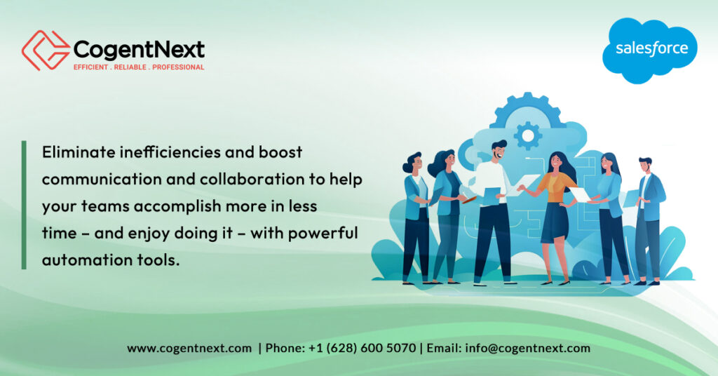
Achieve More with a Partner You Can Trust
Understanding and utilizing Salesforce reports and dashboards can be a game-changer for your business, helping you make informed decisions and drive growth. However, navigating the vast capabilities of Salesforce might require expert guidance. That’s where CogentNext Technologies comes in. With our expertise, we can help you unlock the full potential of your data, ensuring you’re not just collecting information but transforming it into actionable insights.