
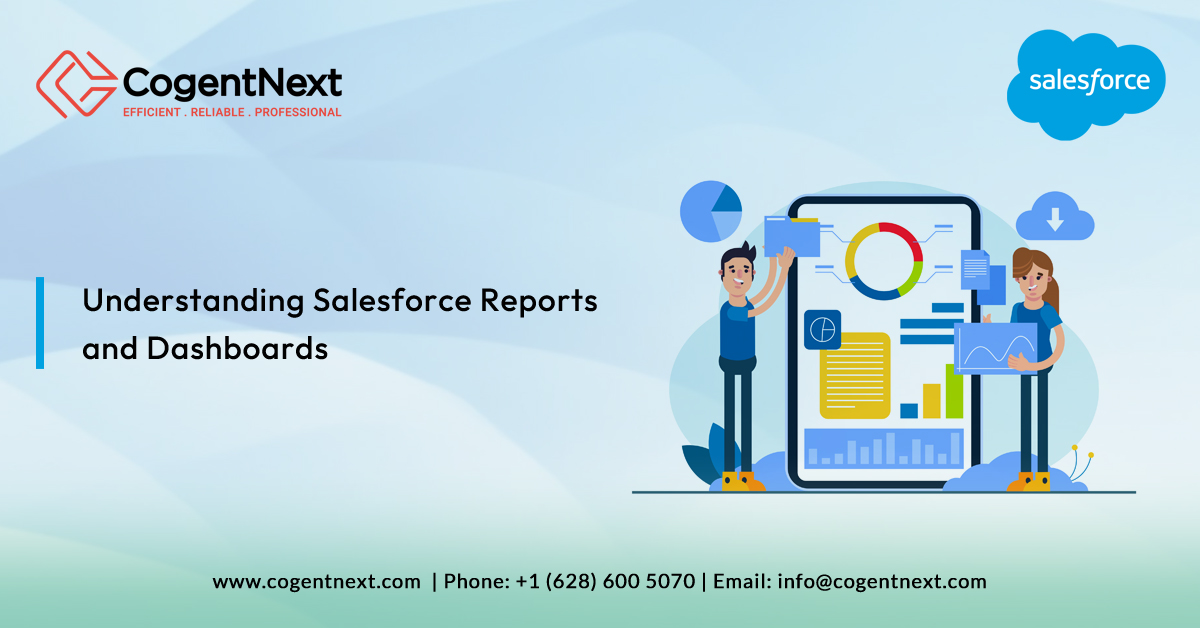
Salesforce Reports and Dashboards: A Comprehensive Guide
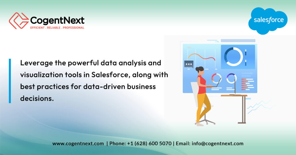
In today’s dynamic business environment, the absence of data-driven insights is akin to moving through uncharted territory without a map. For those utilizing Salesforce, reports and dashboards are the navigational tools that shed light on the path ahead, offering vital insights that empower organizations to gauge their performance, spot emerging trends, and base their decisions on solid data. Let’s explore the significance of these invaluable tools in the contemporary business landscape.
The Spectrum of Salesforce Reports
Salesforce reports go beyond mere number crunching and text aggregation; they are vibrant, adaptable visual narratives that make your data speak volumes. Let’s examine the different report types at your disposal and their utility:
- Tabular Reports: Imagine these as the enhanced version of your standard spreadsheets, equipped to list your data succinctly. Whether you’re reviewing all your contacts or enumerating leads, these reports simplify data presentation.
- Summary Reports: Elevating your data analysis, summary reports allow for categorizing and grouping your data. Visualize assessing your sales by region or by product category—these reports streamline such analyses.
- Matrix Reports: A treasure for those who value detailed cross-analysis, matrix reports offer the ability to group data across both axes for a layered understanding, perfect for juxtaposing product sales across different territories and timelines.
- Joined Reports: For a side-by-side comparison of interconnected data points, joined reports are invaluable. They facilitate a comprehensive analysis, such as juxtaposing sales figures against customer service metrics.
- Cross Filters Reports: Delve deeper into your data with cross filters reports, which offer the precision of multi-layered filtering for granular analysis, unveiling the specific insights you seek.
Delving into Salesforce Dashboards
Translating data into a coherent narrative about your business’s trajectory, Salesforce dashboards utilize charts, graphs, and other visual elements to simplify complex datasets. Here’s a closer examination of the array of dashboards available and their applications:
- Standard Dashboards: Begin your data visualization journey with these ready-made insights into key business metrics such as sales lead tracking or customer service efficiency.
- Customizable Dashboards: Craft dashboards that align precisely with your needs, choosing the data to showcase and its presentation, ensuring focus on the priorities of your team.
- Dynamic Dashboards: These adaptive dashboards tailor the displayed data according to the viewer, offering personalized insights for various roles from a singular dashboard framework.
- Mobile Dashboards: In our fast-paced era, these dashboards ensure that critical business insights are always within reach, facilitating swift, informed decision-making regardless of your location.
- Historical Dashboards: For a backward glance that informs the future, historical dashboards track your progress over time, aiding in the formulation of more accurate forecasts.
- Comparative Dashboards: Highlight disparities and achievements across different business segments, simplifying the identification of areas excelling or in need of attention.
- Console Dashboards: Tailored for Salesforce Service Cloud users, they provide an all-encompassing view into customer service operations, from case handling to agent performance metrics.
- Visualforce Dashboards: For those seeking unparalleled customization, Visualforce dashboards use Salesforce’s robust programming language to craft unique dashboard experiences.
- AppExchange Dashboards: Broaden your dashboard functionalities with third-party applications from Salesforce’s AppExchange, enriching your data visualization tools.
Maximizing Salesforce Reports and Dashboards: Strategies and Practices
Transforming raw data into actionable insights requires not just tools but wisdom. Below are methodologies and practices to enhance the creation and utilization of reports and dashboards:
- Data Precision: Begin with identifying and utilizing the correct data metrics that align with your strategic goals, refining the focus of your data tracking to impact decision-making positively.
- Consistency in Naming: Implement and adhere to a uniform naming convention across your reports, dashboards, and folders for ease of organization and retrieval.
- Privacy and Accessibility: Utilize Salesforce’s robust security measures to control access to sensitive reports and dashboards, ensuring data integrity and relevance.
- Continuous Review: The business landscape and data evolve; regularly update your reports and dashboards to maintain their accuracy and alignment with your business strategy.
- Promote Collaboration: Foster a culture of informed decision-making by sharing key insights across teams, leveraging Salesforce’s sharing capabilities to ensure cohesive data usage.
- Clarity and Branding: Prioritize simplicity in your reports and dashboards to enhance comprehensibility and engagement, employing your organization’s branding for consistency.
Harnessing the full spectrum of Salesforce reports and dashboards can pivotally shift your business towards more strategic, informed decision-making. Yet, mastering these tools might require expert navigation. That’s where CogentNext Technologies steps in. Our deep dive into Salesforce will help you not just collect data but turn it into a compelling narrative for your business.